billboard <- read_csv('https://bcdanl.github.io/data/billboard.csv')Classwork 10
1 Billboard Charts
The following data is for Question 1:
1.0.1 .
Describe how the distribution of rating varies across week 1, week 2, and week 3 using the faceted histogram.
install.packages("ggplot2")
library(ggplot2)

ggplot(billboard, aes(x = wk1)) +
  geom_histogram(binwidth = 1, fill = "blue", color = "black", alpha = 0.7) +
  facet_wrap(~year, scales = "free_x", ncol = 3) +
  labs(title = "Distribution of Ratings Across Weeks 1, 2, and 3",
       x = "Rating",
       y = "Frequency") +
  theme_minimal()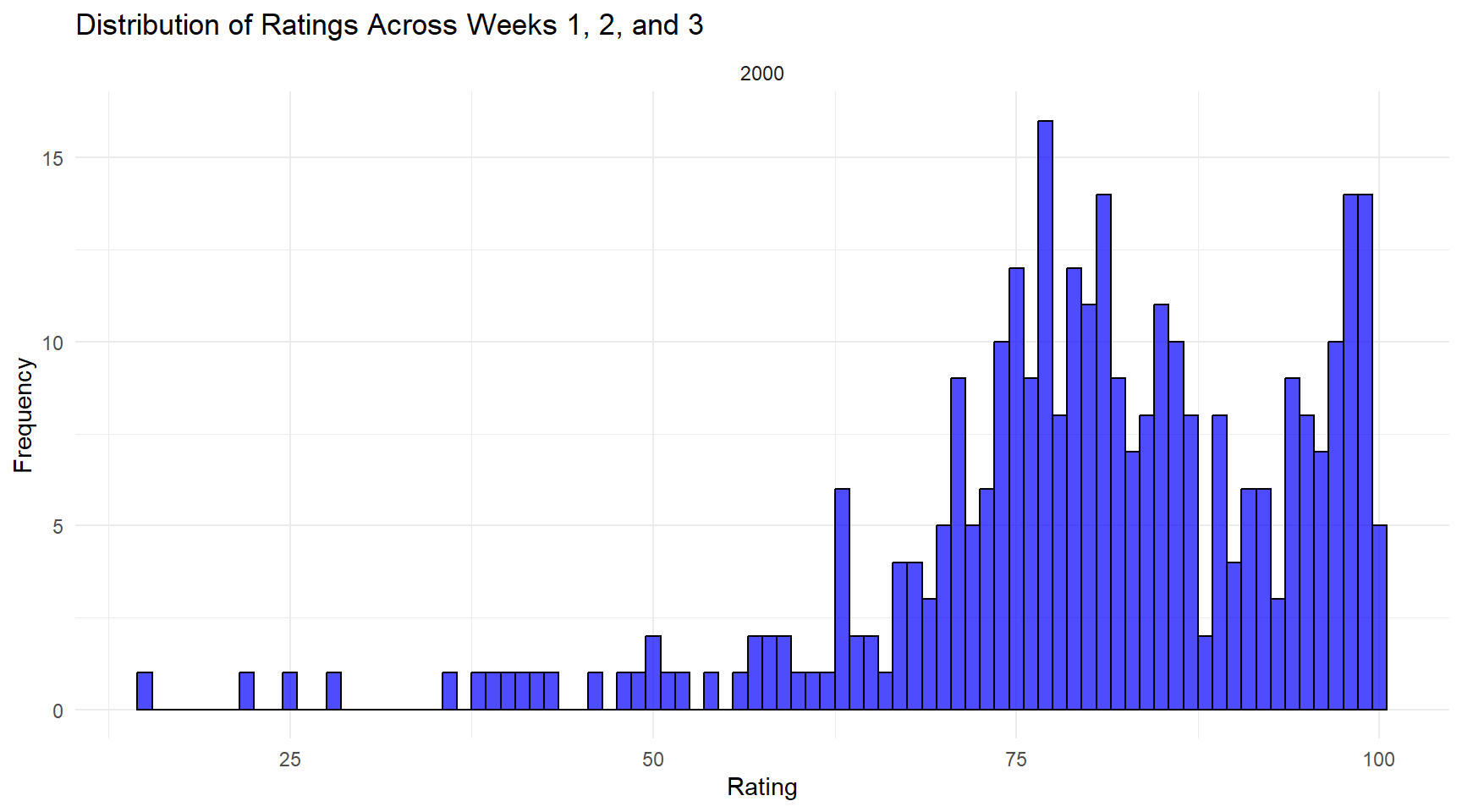
1.0.2 .
Which artist(s) have the most number of tracks in billboard data.frame?
Do not double-count an artist’s tracks if they appear in multiple weeks.
artist_track_counts <- billboard %>%
  group_by(artist) %>%
  summarise(unique_tracks = n_distinct(track))

top_artists <- artist_track_counts %>%
  filter(unique_tracks == max(unique_tracks))
2 Average Personal Income in NY Counties
The following data is for Question 2:
ny_pincp <- read_csv('https://bcdanl.github.io/data/NY_pinc_wide.csv')2.0.1 .
Make ny_pincp longer.
q2a <- ny_pincp %>%
  pivot_longer(cols = pincp1969:pincp2019,
               names_to = "year",
               values_to = "pincp")
2.0.2 .
Provide both (1) ggplot code and (2) a simple comment to describe how overall the yearly trend of NY counties’ average personal incomes are.
ggplot(q2a, aes(x = year, y = pincp, group = fips, color = geoname)) +
  geom_line() +
  labs(title = "Yearly Trend of NY Counties' Average Personal Incomes",
       x = "Year",
       y = "Average Personal Income") +
  theme_minimal() +
  theme(legend.position = "none") +
  theme(axis.text.x = element_text(
  angle = -45,
  hjust = 0,
  vjust = 1
))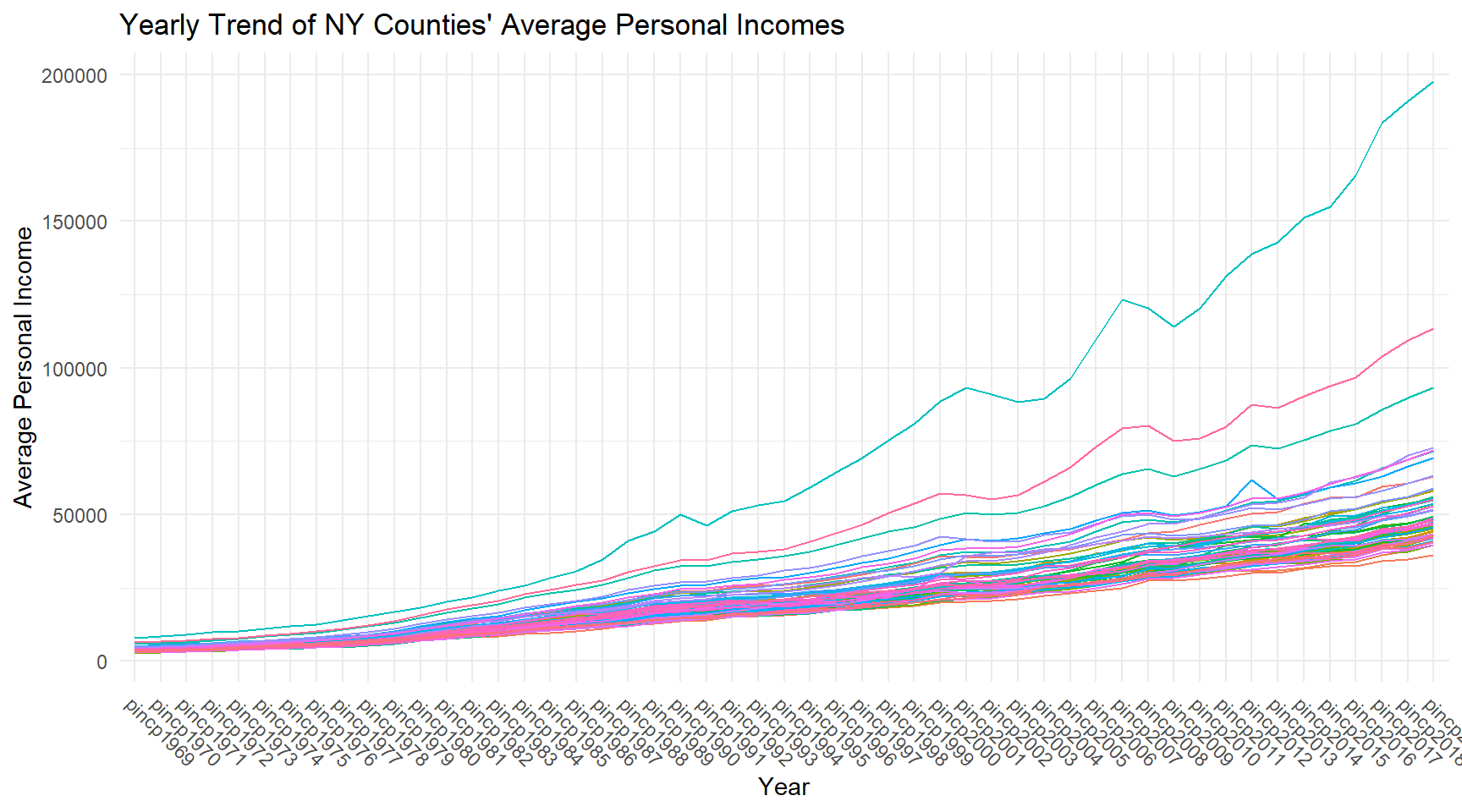
This ggplot code creates a line plot to visualize the yearly trend of New York counties’ average personal incomes. Each line corresponds to a county, differentiated by color, and the x-axis represents the years. The ‘pincp’ variable is used for the y-axis, and ‘geoname’ is used to label the lines with county names. The ‘fips’ variable is used to group the data by county.
3 COVID-19 Cases
The following data is for Question 3:
covid <- read_csv('https://bcdanl.github.io/data/covid19_cases.csv')3.0.1 .
-Keep only the following three variables, ‘date’, ‘countriesAndTerritories’, and ‘cases’.
-Then make a wide-form data.frame of covid whose variable names are from countriesAndTerritories and values are from cases.
-Then drop the variable date.
library(dplyr)
library(tidyr)

covid_subset <- covid %>%
  select(date, countriesAndTerritories, cases)

covid_wide <- covid_subset %>%
  pivot_wider(names_from = countriesAndTerritories, values_from = cases)

covid_final <- covid_wide %>%
  select(-date)