beer_markets <- read_csv('https://bcdanl.github.io/data/beer_markets.csv')Let’s analyze the beer_markets data:
rmarkdown::paged_table(beer_markets) Variables for beer_markets data.frame
The following are the variables present in the beer_markets data.frame.
-‘hh’ -’_purchase_desc’ -‘quantity’ -‘brand’ -‘dollar_spent’ -‘beer_floz’ -‘price_per_floz’ -‘container’ -‘promo’ -‘market’ -‘buyertype’ -‘income’ -‘childrenUnder6’ -‘children6to17’ -‘age’ -‘employment -’degree’ -‘cow’ -‘race’ -‘microwave’ -‘dishwasher’ -‘tvcable’ -‘singlefamilyhome’ -‘npeople’
Figure 1
Provide both (1) ggplot code and (2) a simple comment to describe how ‘dollar_spent’ varies by ‘income’ and ‘employment’.
library(ggplot2)

ggplot(beer_markets, aes(x = income, y = dollar_spent, fill = employment)) +
  geom_boxplot() +
  labs(title = "Variation of 'dollar_spent' by 'income' and 'employment'",
       x = "Income",
       y = "Dollar Spent") +
  facet_wrap(~ employment, scales = "free_y", ncol = 2) +
  theme_minimal()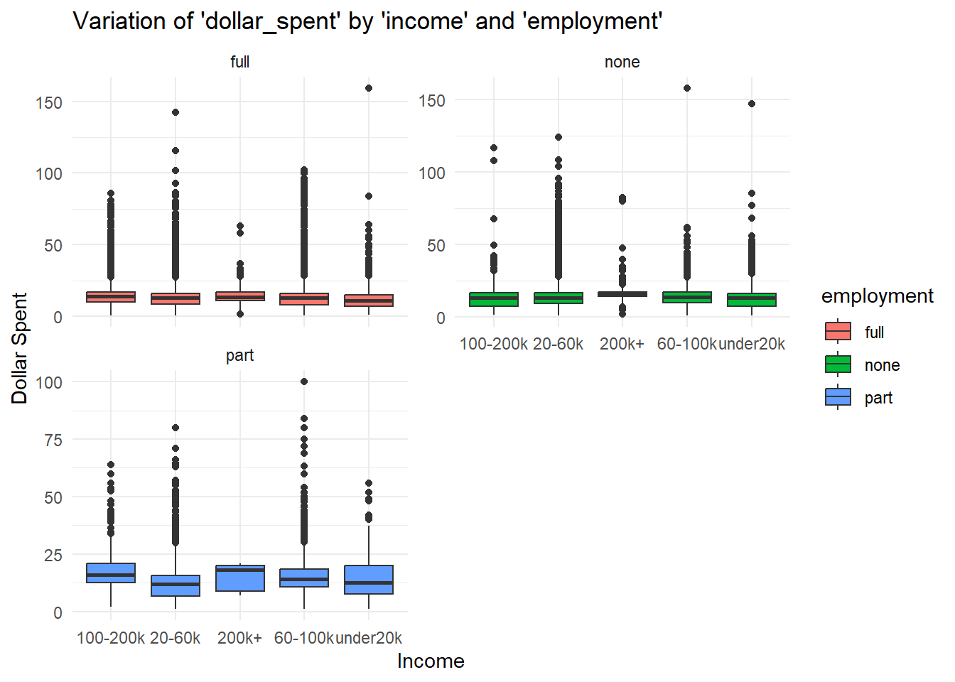
The boxplot shows how ‘dollar_spent’ varies by ‘income’ and ‘employment’ in the beer markets dataset. Some significant findings is the part-time workers who have an income of 200k+ are prone to spend the most ammount of money on beer. In addition I thought it was interesting the people with no employment spend almost as much money on beer as people with full time jobs.
Figure 2
Provide both (1) ggplot code and (2) a simple comment to describe how ‘brand’ varies by ‘buyertype’
ggplot(beer_markets, aes(x = buyertype, fill = brand)) +
  geom_bar(position = "dodge", stat = "count") +
  labs(title = "Variation of 'brand' by 'buyertype'",
       x = "Buyer Type",
       y = "Count") +
  theme_minimal() +
  theme(axis.text.x = element_text(angle = 45, hjust = 1))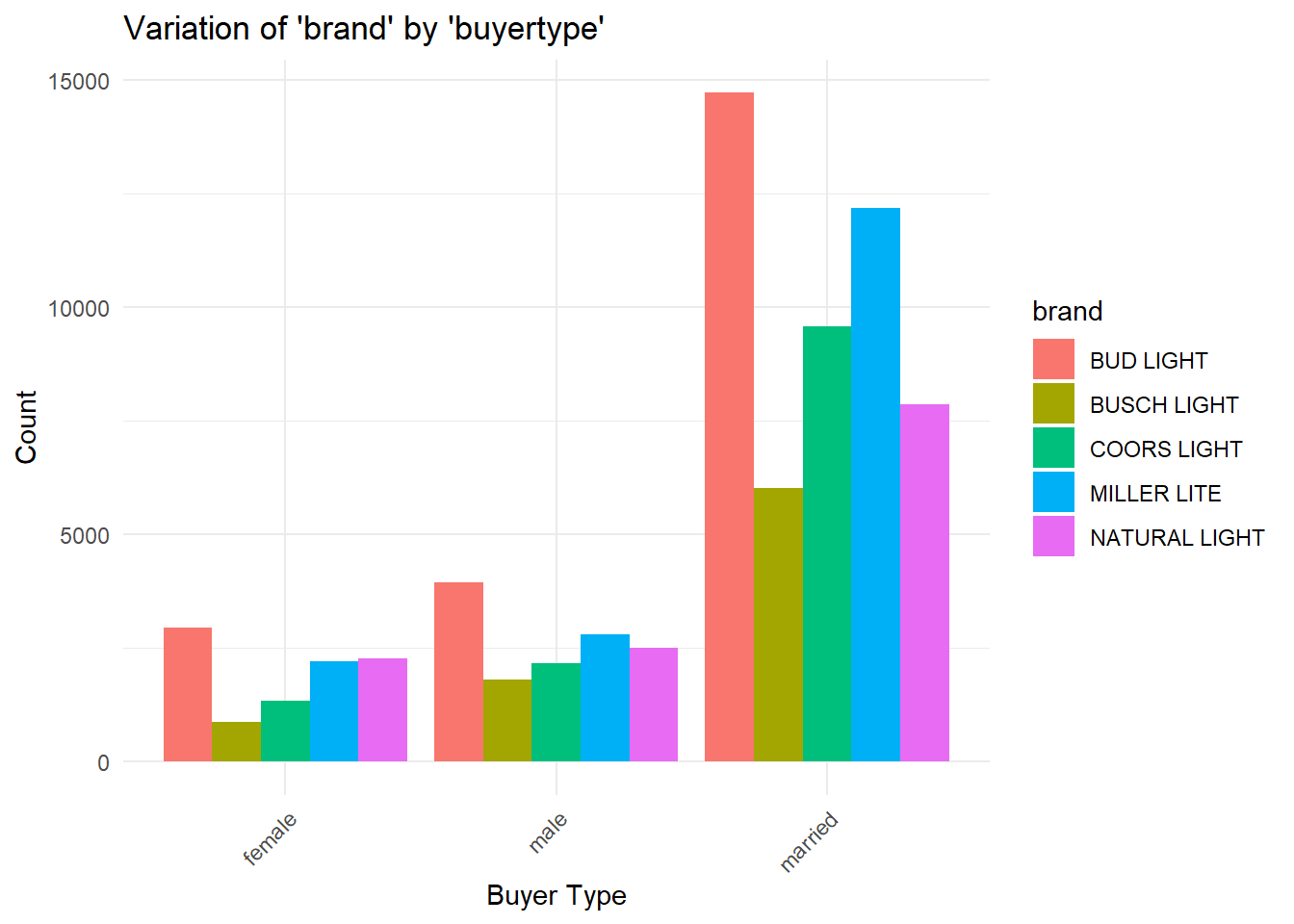
The bar plot illustrates the distribution of ‘brand’ across different ‘buyertype’ categories in the beer markets dataset. Some interesting findings that I wanted to mention were that Bud Light was the most bought type of beer amongt all the buyer types, whilst Bush Light was the least bought.
Figure 3
Provide both (1) ggplot code and (2) a simple comment to describe how ‘brand’ varies by ‘container’
ggplot(beer_markets, aes(x = brand, fill = container)) +
  geom_bar(stat = "count", position = "dodge") +
  labs(title = "Variation of 'brand' by 'container'",
       x = "Brand",
       y = "Count") +
  theme_minimal() +
  theme(axis.text.x = element_text(angle = 45, hjust = 1))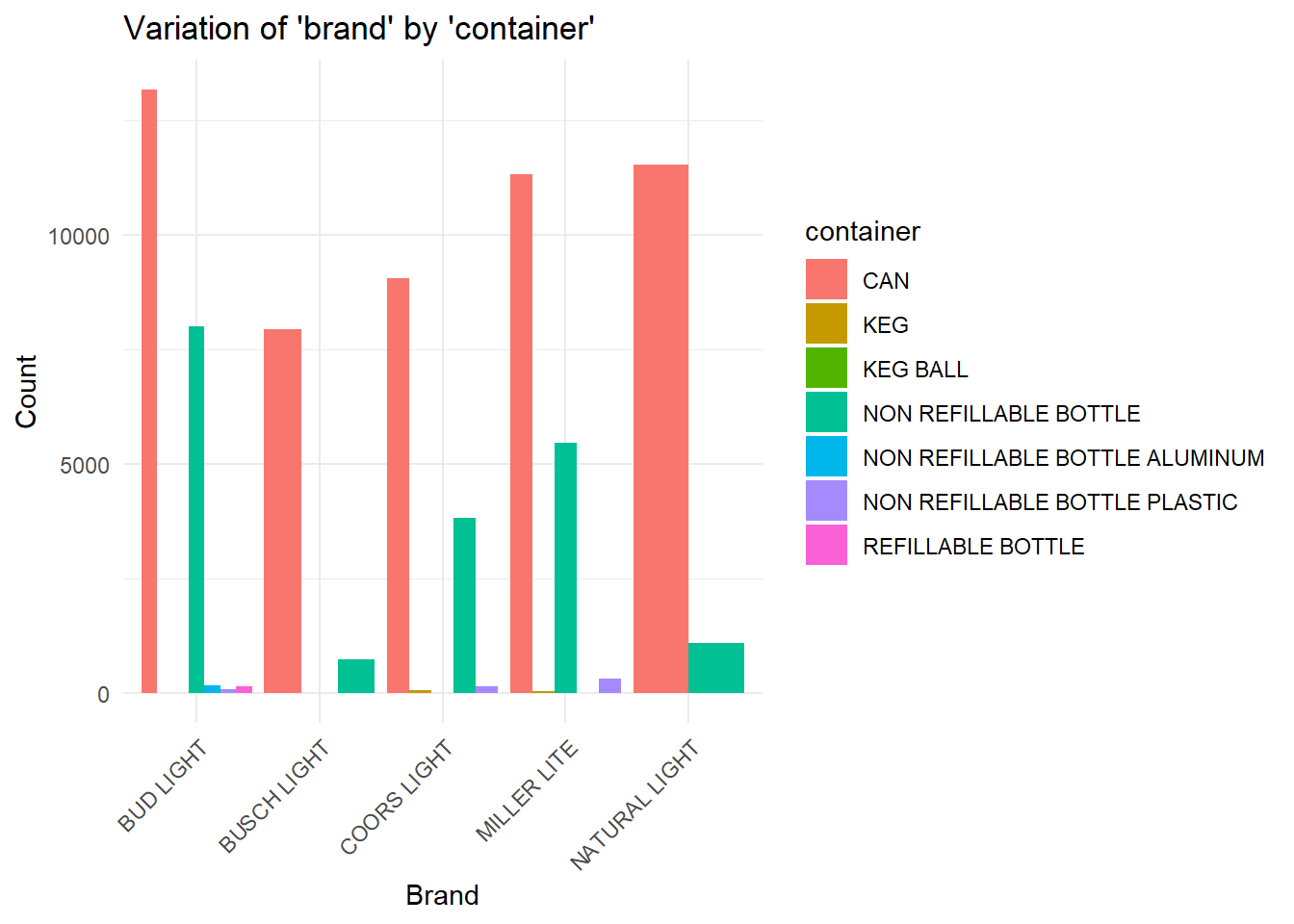
The bar plot displays how ‘brand’ varies based on the ‘container’ type in the beer markets dataset. Some analysis of the chart shows us that most beer brands manufacture using cans as their predominant container of choice, while a non refillable bottle is a decent secondary option.