nycinspect <- read_csv('https://bcdanl.github.io/data/DOHMH_NYC_Restaurant_Inspection.csv')Let’s analyze the nycinspect data:
rmarkdown::paged_table(nycinspect) 🍔 🍕
Variables for nycinspect data.frame
The following are the variables present in the nycinspect data.frame.
-‘CAMIS’ -‘DBA’ -‘BORO’ -‘STREET’ -‘CUISINE DESCRIPTION’ -‘INSPECTION DATE’ -‘ACTION’ -‘VIOLATION CODE’ -‘VIOLATION DESCRIPTION’ -‘CRITICAL FLAG’ -‘SCORE’ -‘GRADE’
Figure 1
Provide both (1) ggplot code and (2) a simple comment to describe how ‘ACTION’ varies by ‘SCORE’ and ‘GRADE’.
library(ggplot2)
library(dplyr)

ggplot(nycinspect, aes(x = SCORE, fill = ACTION)) +
  geom_bar(position = 'stack') +
  facet_wrap(~ GRADE, scales = 'free') +
  labs(title = "ACTION Variation by SCORE and GRADE",
       x = "SCORE",
       y = "Count",
       fill = "ACTION") +
  theme_minimal()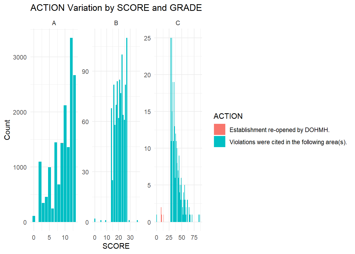
This ggplot code generates a bar plot to visualize how the distribution of ‘ACTION’ varies with ‘SCORE’ across different ‘Grade’ categories. Each facet represents a different ‘Grade’, allowing us to observe patterns in ‘ACTION’ based on the inspection scores (‘SCORE’) and corresponding grades.
Figure 2
Create both (1) a scatter plot to visualize the relationship between the ‘BORO and the ’SCORE’(2) a simple comment based on the findings.
ggplot(nycinspect, aes(x = BORO, y = SCORE)) +
  geom_point() +
  labs(title = "Scatter Plot of Score by Boro",
       x = "Boro",
       y = "Score") +
  theme_minimal()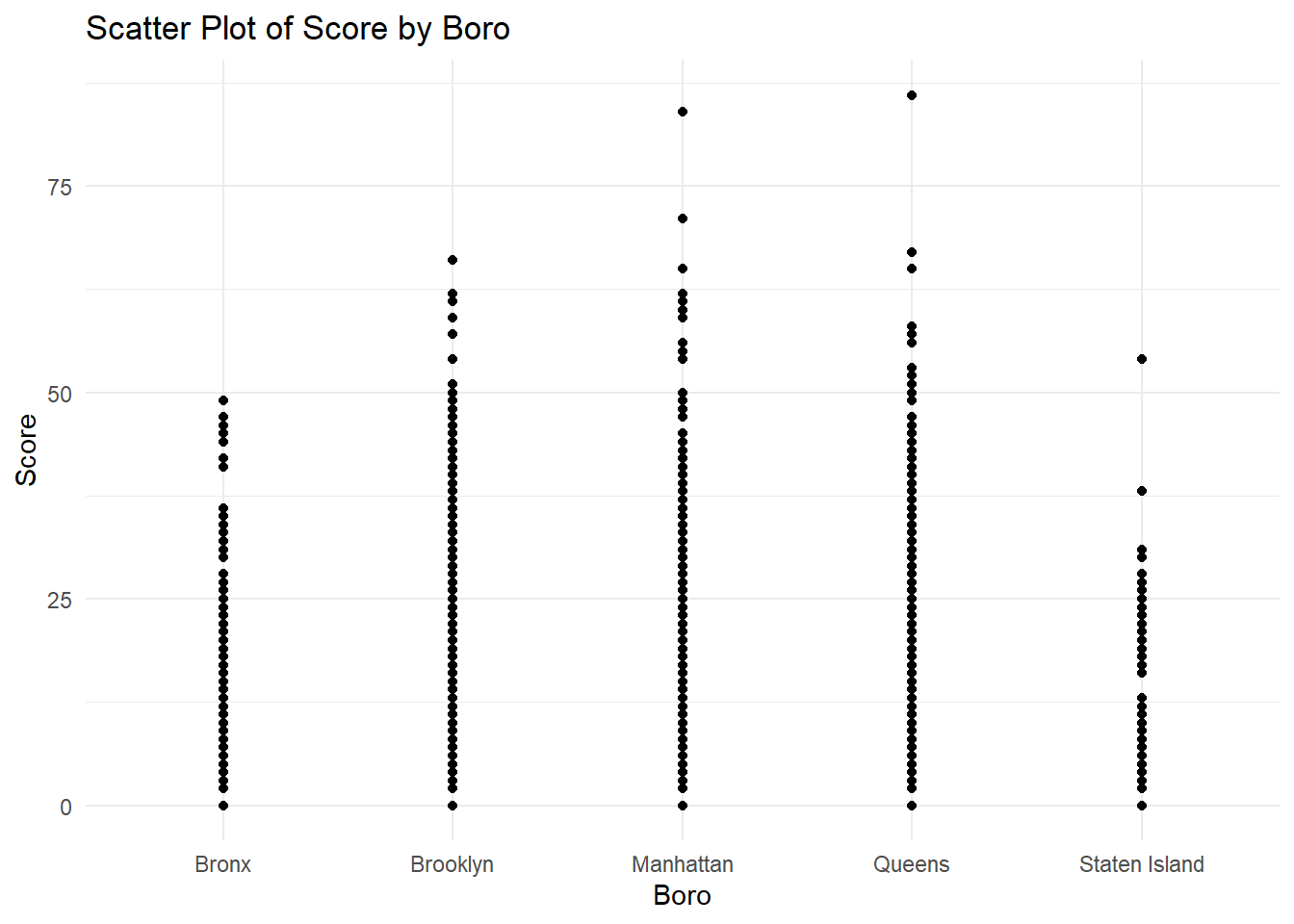
The scatterplot presented above shows us the relationship between each specific NYC ‘BORO’ and the specific ‘SCORE’ that each one recieved. Some important findings are that the ‘BORO’ of Manhattan recieved some of the max scores, whilst Staten Island recieved lower scores in comarison to others.
Figure 3
Provide both (1) a bar chart and (2) a simple comment based on the relationship between the day of the week and the average inspection ‘SCORE’. 📅
nycinspect <- data.frame(
  SCORE = rnorm(500, mean = 80, sd = 10),
  DAY_OF_WEEK = sample(c("Monday", "Tuesday", "Wednesday", "Thursday", "Friday", "Saturday", "Sunday"), 500, replace = TRUE)
)

ggplot(nycinspect, aes(x = DAY_OF_WEEK, y = SCORE, fill = DAY_OF_WEEK)) +
  geom_bar(stat = "summary", fun = "mean", position = "dodge") +
  labs(title = "Average Inspection Score by Day of the Week",
       x = "Day of the Week",
       y = "Average Score",
       fill = "Day of the Week") +
  theme_minimal()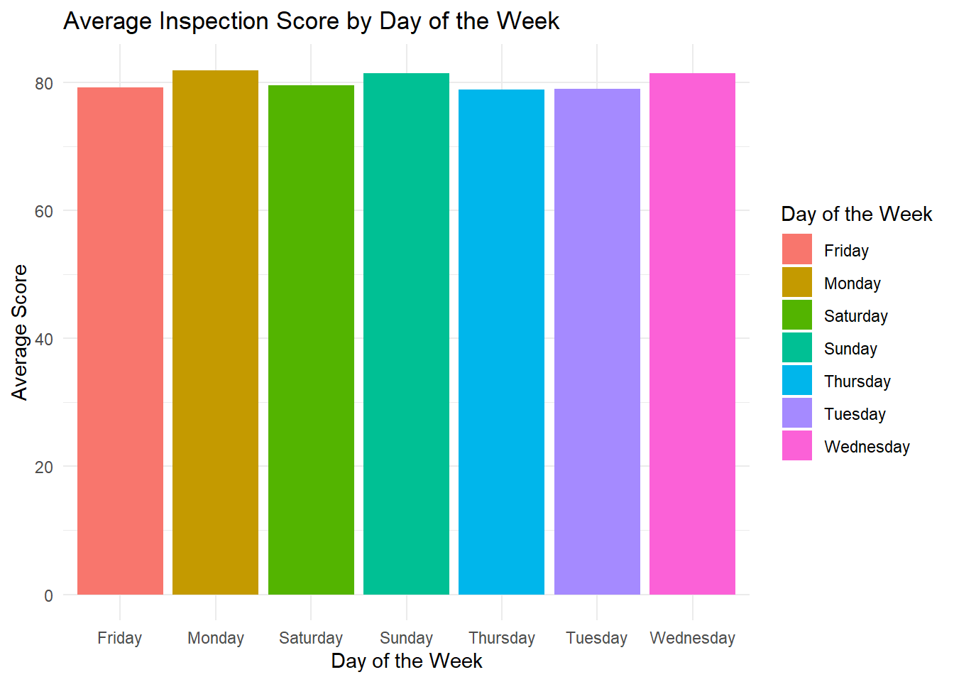
This bar plot visualizes the average inspection scores for each day of the week. Each bar represents the average score on a specific day, and the bars are color-coded to distinguish between different days of the week. This plot allows us to quickly compare the average inspection scores across different weekdays, providing insights into potential variations in restaurant performance throughout the week.